
How Design Changed the Olympics Forever

This article was first published in the London Design Festival 'Red Book' (print) and website in 2021.
The Tokyo 1964 Summer Olympic Games marked several world firsts. It was the first Olympics to be hosted in Asia, the first to feature an Olympic Torch Relay across the whole host country and the first to use the word Paralympic.
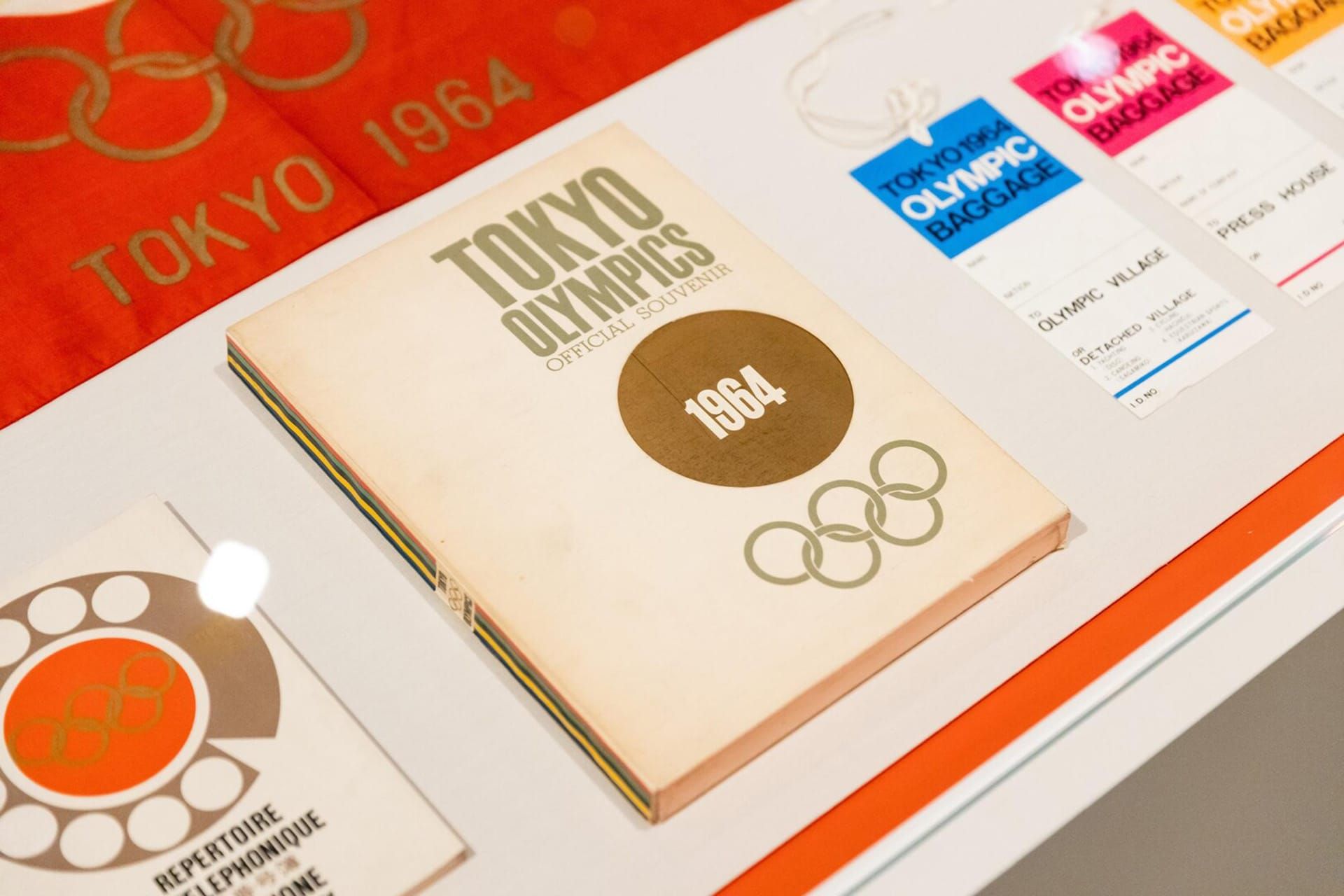
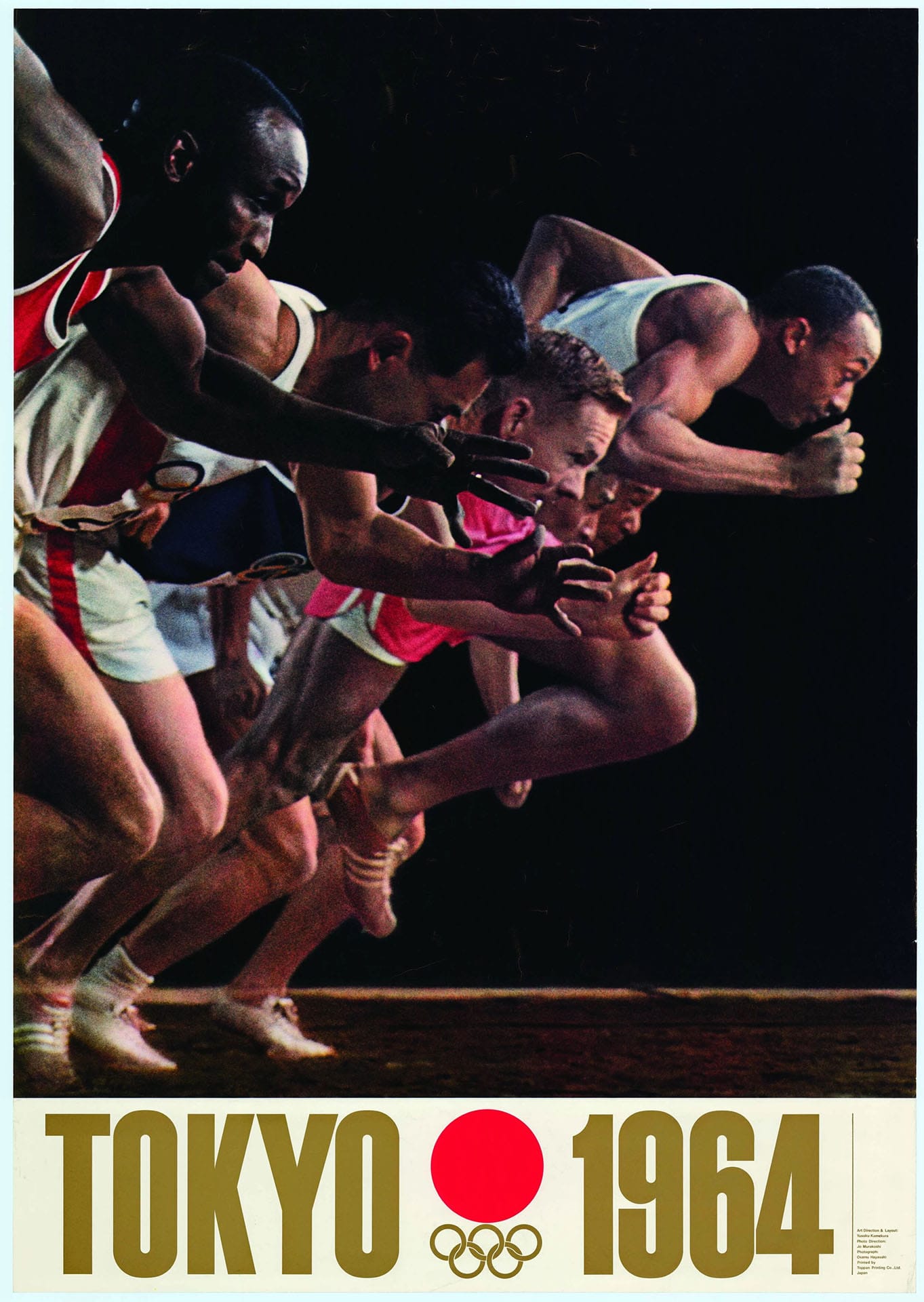
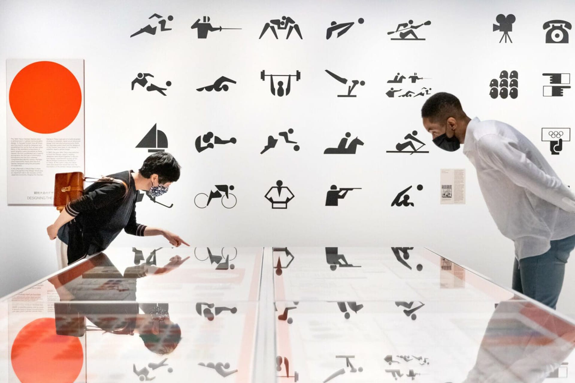
It was also a significant Olympics in terms of design, pioneering a completely different approach. 1964 saw the creation of a consistent graphic identity, the use of photography in promotional material and the development of pictograms to represent the different sporting disciplines.
"The Tokyo 1964 Olympics committee had this very conscious policy to put design and architecture at the front of how they would create these games," says Simon Wright, director of programming at Japan House London, which is hosting the 'Tokyo 1964: Designing Tomorrow'. The exhibition presents original artefacts and records that tell the story of how a group of architects and creatives brought Japan's design-forward culture to the world stage.
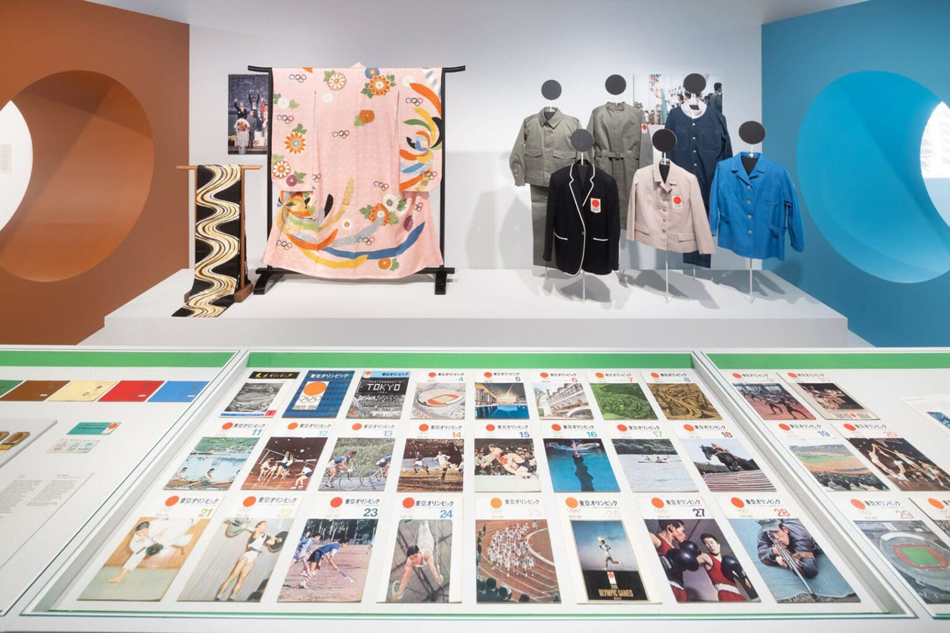
Photos courtesy Japan House London
From the get-go, the Tokyo 1964 committee set a very clear goal for the games to be perceived as uniquely Japanese. From the inauguration of the Shinkansen high-speed railway line to the monorail from the airport into the city, the split-second accuracy of Seiko timepieces and the first colour broadcasting using geostationary satellites, these Olympics made a statement. The approach was intended as a catalyst to change the global narrative regarding Japan following WW2.
The organisers gathered a group of well-known architects whose work endures. It's not uncommon for Olympic venues to fall into disrepair in the years that follow the games. In contrast, the Olympic Control Tower at the Komazawa Olympic Park by Yoshinobu Ashihara, the Yoyogi National Gymnasium by Kenzo Tange and the Nippon Budokan by Mamoru Yamada, are still active today.
While architecture and technology had long been considered effective means to increase a country's soft power, the use of design for these games was particularly interesting. A thorough design guide was devised to ensure coherence in the application of logos, typefaces and colours (although it was developed almost in parallel with the actual work, due to how busy the design team were). Graphic design was employed to overcome cultural and language barriers. Take for example the use of pictograms — similar to today's emojis — to represent each of the sporting activities. They were simpler and faster than words to convey the message and have since then become a mainstay of the Olympics.
From the logo to typography and 'emojis', 1964 pioneered a new graphic identity.
One of the rising stars of the design team was Yusaku Kamekura, who came up with the iconic red and gold logo. Kamekura was influenced by the modernist zeitgeist of the time, so it's no surprise that he chose Neue Haas Grotesk (now better known as Helvetica) as the official typeface. His promotional posters feel as fresh today as they were back then, blending imagery and typography in a way that's reminiscent of traditional Japanese paintings. Many of the young talents that worked with him would later become big names in the world of design, too.
Japanese history is divided into intervals named after special events and the ruling emperors, like the Edo period or the Meiji era. In a similar way, 1964 marked the start of a new age for the Olympic Games that's still going strong: the era of design.